This blog post includes the step-by-step details of an Interactive Waffles code-through. A Shiny-enabled version is also available.
Introduction
In this code-through, we are going to walk through the process of creating waffle charts to represent the statistical findings of the 100 People Project.
Set-Up
Install R and RStudio
The data analysis software that we will be using in this code-through are the open source software products R and RStudio. Therefore, you must have both installed on your device to follow along.
If you do not have R and RStudio on your device, you can download the appropriate software for your device at the following links: R and RStudio.
However, if you already have R and RStudio installed, then you can skip ahead to the next section.
Install R-Markdown and Shiny.
One of the most useful features of RStudio is its ability to create fancy documents known as R-Markdown files that end with .rmd. These files can often be deployed to .html files that can be sent to others to explore your data. However, in situations where the coding can not be hosted in a .html file (such as in the case of this code-through which will be utilizing an R package called shiny which is not compatible with traditional .html files), RStudio can export files to a web server that can host interactive documents.
To begin, you will need to have the R Markdown package installed on your computer. To check whether you have the package installed, you can enter the following code into your console in RStudio:
installed.packages(“rmarkdown”)
If you do not have R Markdown installed, then you will enter the following code:
install.packages(“rmarkdown”)
After R Markdown is successfully installed, you will need to install a package known as Shiny which will enable us to create an interactive document. Following the same steps above, you can check if you already have Shiny installed with the following code:
installed.packages(“shiny”)
If Shiny is not installed, then you will install it with the following code:
install.packages(“shiny”)
Set Up Interactive Document
Once R Markdown and Shiny are successfully installed, then we can begin the process of creating an interactive Shiny document.
Following the instructions on RStudio’s Shiny Help Articles you can open up the dialog box to create a New File and then a New R Markdown.
This will then present you with a dialog box like the following:
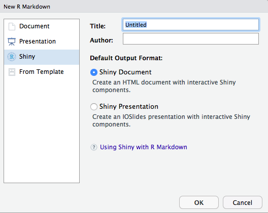
In this dialogue box, you want to select the Shiny option on the left hand side of the screen. If you would like, you can also enter a title in the title box and your name in the author box. If not, you can enter these later. The most important thing here is to select the Shiny Document option to create an interactive HTML page document.
Once these options are selected, click okay and you will be taken to the document in RStudio where you will see the following screen:
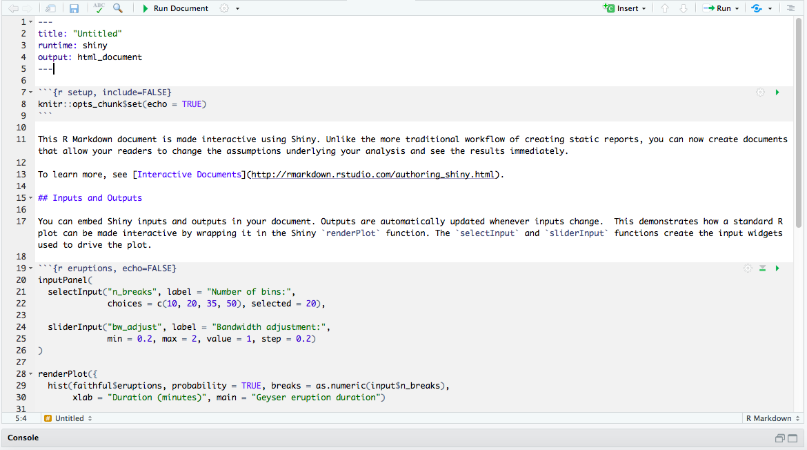
There is quite a lot of information here, including a link to RStudio’s Shiny Help Articles. I would suggest clicking the Run Document button at the top of the screen to get a feel for the interactive nature of the document and preview all of the features that can be tailored to your individual needs.
After you have completed playing with the interactive output, return to the main RStudio window where we will examine the document.
First, you will notice the YAML header at the top of the page:
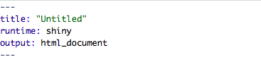
If you did not enter your name or the title in dialog box to create the file, then the default is for the document to contain just 3 elements in the YAML header:
- title
- runtime
- output
The runtime and output elements are the most critical because they are needed to tell RStudio to run the file through Shiny to make the document independent and to make the output an HTML document.
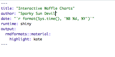
However, we can also customize this header a bit to look something like this:
 `
`
These changes provide:
-
A detailed title so that viewers of your interactive document can understand the subject immediately.
-
An author for the document so that you can be credited for the document and/or contacted about any issues with the document.
-
A date to give an estimate of how recent the information presented has been curated.
-
Same as above, the Shiny runtime for interactivity.
-
A fancier format for your HTML document. RMarkdown is compatible with quite a few different templates. Andrew Zieffler created an awesome gallery of all of the different templates available that you can view by here. Specifically, the theme used for this code-through is presented here and can be accessed by entering the following code in your RStudio Console:
install.packages(“rmdformats”)
Customization
Now that we have the basic settings in place, we will add a few details to our document. There will be three primary categories throughout the file:
- Code Chunks
- Sections
- Plain Text
You can also view the R Markdown Cheatsheet for assistance with all of these customizations.
Code Chunks
Following the YAML header at the top of your document, the next section of the file that you see is what’s known as a code chunk:

The sample codes detailing how to check for installed packages and install packages included in this code-through are all examples of code chunks. These are where you will run your R Formula in RMarkdown and are essential to all data analysis.
For this tutorial, we will have several code chunks to do everything from running packages to defining our data set.
Sections
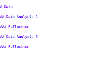
The sections element of the document is relatively self-explanatory and serves as the way that you will “break down” your findings in your HTML document to make your data easy for you to navigate and for your viewers to understand. As shown in the image below, these headers are defined in RMarkdown by using the ‘#’ sign known as a ‘pound sign’, ‘number sign’, or more recently, a ‘hashtag’:
Plain Text
As implied by the name, plain text is the basic text that is written in a RMarkdown file to provide details, answers, or any other form of text needed to accompany the code chunks. This text can be stylized with asterisks, html code, and other features as mentioned on the RMarkdown cheat sheet to enhance its appearance.
Waffle Preparation
Packages
Before we can begin our data analysis, we need a few “ingredients”. Most importantly, we need to install the packages we will be using to create our waffles:
install.packages("dplyr")
install.packages("ggplot2")
install.packages("extrafont")
install.packages("hrbrthemes")
devtools::install_github("hrbrmstr/waffle")
install.packages("pander")
install.packages("tidyverse")
Library
Once these packages have been installed, we will add them to our library with the following code chunk:
library(ggplot2)
library(extrafont)
library(hrbrthemes)
library(waffle)
library(pander)
library(dplyr)
library(shiny)
library(knitr)
Data
Now that we have installed R, RStudio, RMarkdown, Shiny, and all of our packages, we’re ready to begin our data analysis.
First, we’re going to load the data from the study that is serving as the basis for our analysis: 100 People Project.
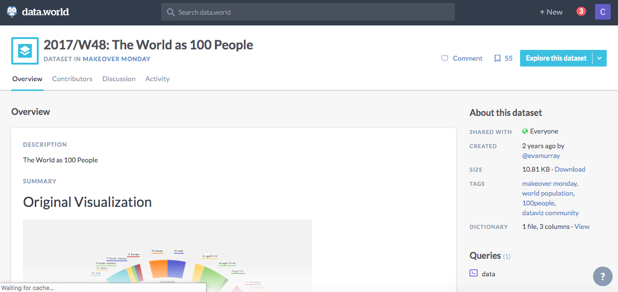
Back in December 2017, an organization that has become very popular in the data visualization community, Makeover Monday, challenged data designers and storytellers to tackle the If The World Were 100 People statistics and create a myriad of ways to display the data. They received several entries and made an interesting blog post about in addition to posting the challenge on data.world.
We will be loading our data from the second link.
If you would like to download a copy to keep on your device locally, click the Explore This Dataset button as displayed below:
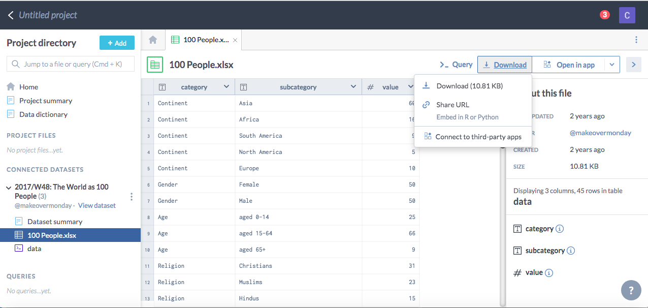
This will take you to the project directory where you can click on the data set file 100 People.xlsx and then select the download button to either download the Excel file or get a link to use in R.
For this code-through, we will be using the link option as displayed in the following code chunk:
library("httr")
library("readxl")
GET("https://query.data.world/s/4ls6kvwluilh4yib4htv5xd43jj663", write_disk(tf <- tempfile(fileext = ".xlsx")))
dat <- read_excel(tf)
Preview Data
dat %>% pander()
[input screenshot]
A review of the data in comparison to the project’s website indicates that Poverty has a wrong number (the 48 should be an 11) and there is not a row for the number of people who do not live on less than $2 a day, which is critical for our waffle categories. Therefore we will make a few changes.
First, we will delete the inaccurate row of data by referencing its row number in the data:
d1 <- dat[-c(27),]
Next, we will add the correct number of people who live on less than $2USD a day, which is 11.
d2 <- rbind(d1, list("Poverty", "live on less than 2 US dollars per day", 11 ) )
Last, we will add the correct number of people who live on $2USD per day or more, which is 100 minus 11 or 89.
People <- rbind(d2, list("Poverty", "live on 2 US dollars per day or more", 89) )
People %>% pander()
Waffle Creation
Now that we have the tools we need, we can begin creating our waffles.
Basic Waffle
First, we will create a basic waffle. In order to accomplish this, we will use the dpylr library to sort through our data and create a mini dataset:
ContData <- People %>%
  filter(Category == "Continent")
This dataset will give us a 100 people to display in our basic waffle:
library(hrbrthemes)
library(waffle)

ggplot(ContData, aes(fill = Subcategory, values = ContData$Value)) +
  geom_waffle(color = "white", size=1.125, n_rows= 5) +
  facet_wrap(~Category, ncol=1,) +
  scale_x_discrete(expand=c(0,0)) +
  scale_y_discrete(expand=c(0,0)) +
  ggthemes::scale_fill_tableau(name=NULL) +
  coord_equal() +
  labs(
    title = "If The World Were 100 People"
  ) +
  theme_ipsum_rc(grid="") +
  theme_enhance_waffle()
And voila! We now have a waffle that displays how the world would be broken down by continent. The vast majority of the world would live in Asia, followed by Africa, South America, and Europe. North America would comes in last place!
Now that we have our basic waffle code, we will finally begin working with Shiny to create an interactive waffle that will allow us to sort through the data by category.
To accomplish this, we must first define our inputs.
The Shiny Widgets Gallery provides us with the codes for a variety of input options that can work with various data types:
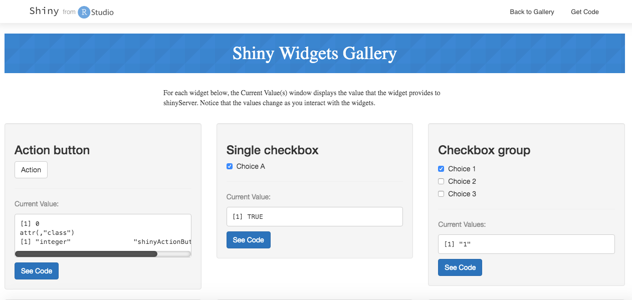
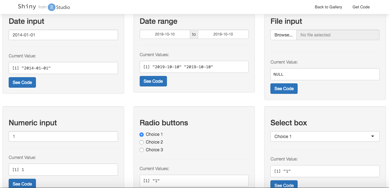
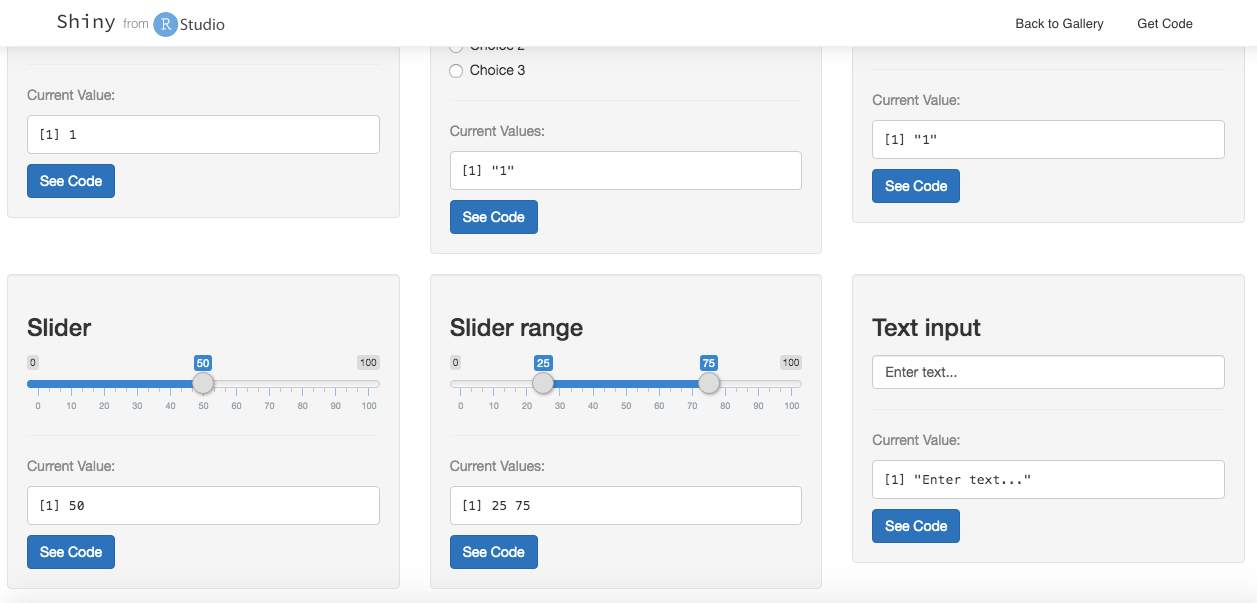
However although there are lots of options to choose from, a quick analysis of our data indicates that we need an option that will work with our Category variable which is discrete and will not work with continuous selection tools. Therefore, the only two suitable inputs are the radio buttons and the select box. Both are displayed in the second image. Since we have a relatively long list of categories, we will go with the select box option.
Next, we will customize our code for the select box and produce our interactive waffle:
library(hrbrthemes)
library(waffle)

  selectInput("category", label = "Select Category:",
              choices = list("Age",
                          "Location" = "Area",
                          "Level of Education" = "College",
                          "Continent",
                          "Gender",
                          "Homelessness" = "Housing",
                          "Internet Access" = "Internet",
                          "First Language" = "Language (first)",
                          "Literacy Level" = "Literacy",
                          "Nutrition",
                          "Cell Phone Access" = "Phones",
                          "Poverty",
                          "Religion",
                          "Water Access" = "Water"),
              selected = "Age")


renderPlot({

InteractiveWaffle <-
  People %>%
  filter( Category %in% input$category )


ggplot(data=InteractiveWaffle, aes(fill = Subcategory, values = Value)) +
  geom_waffle(color = "white", size=1.125, n_rows= 5) +
  facet_wrap(~Category, ncol=1,) +
  scale_x_discrete(expand=c(0,0)) +
  scale_y_discrete(expand=c(0,0)) +
  ggthemes::scale_fill_tableau(name=NULL) +
  coord_equal() +
  labs(
    title = "If The World Were 100 People"
  ) +
  theme_ipsum_rc(grid="") +
  theme_enhance_waffle()

}

)
Interactive Waffle
Now that we have the inputs set up and the code placed inside of Shiny’s ‘renderPlot’ brackets, we have a fully functioning interactive waffle plot!
library(hrbrthemes)
library(waffle)

  selectInput("category", label = "Select Category:",
              choices = list("Age",
                          "Location" = "Area",
                          "Level of Education" = "College",
                          "Continent",
                          "Gender",
                          "Homelessness" = "Housing",
                          "Internet Access" = "Internet",
                          "First Language" = "Language (first)",
                          "Literacy Level" = "Literacy",
                          "Nutrition",
                          "Cell Phone Access" = "Phones",
                          "Poverty",
                          "Religion",
                          "Water Access" = "Water"),
              selected = "Age")

renderPlot({

InteractiveWaffle <-
  People %>%
  filter( Category %in% input$category )


ggplot(data=InteractiveWaffle, aes(fill = Subcategory, values = Value)) +
  geom_waffle(color = "white", size=1.125, n_rows= 5) +
  facet_wrap(~Category, ncol=1,) +
  scale_x_discrete(expand=c(0,0)) +
  scale_y_discrete(expand=c(0,0)) +
  ggthemes::scale_fill_tableau(name=NULL) +
  coord_equal() +
  labs(
    title = "If The World Were 100 People"
  ) +
  theme_ipsum_rc(grid="") +
  theme_enhance_waffle()

}

)
Completion
Congratulations! You have completed this entire code-through of step-by-step instructions and together we have created an interactive waffle!
If you would like to explore the data further, you can view a really cool video data visualization of the 100 People Project below and check out some interesting readings on the project and waffles!
Video
Readings
100 People: A World Portrait: Website that includes detailed data and background information on the project.
MakeoverMonday Challenge: Details on the Makeover Monday Challenge and examples of various data sets.
MakeoverMonday Blog Post: Blog on the MakeoverMonday challenge.
Waffle Infographic Examples: This blog post by Neil Saunders served as inspiration for this code-through.
Waffle Package Github: This website provides details on all things ‘Waffle’ and provides great examples of all the different plotting options.
About The Author
This code-through tutorial was created by Courtney Stowers for CPP 526 Data Science 1 in the Master of Science in Program Evaluation and Data Analytics program at Arizona State University. She can be contacted at: courtney.stowers@asu.edu.
Clip art credit: Gerd Altmann, Pixabay